Dashboards & visibility
What should a business dashboard show? Start with decisions, not charts
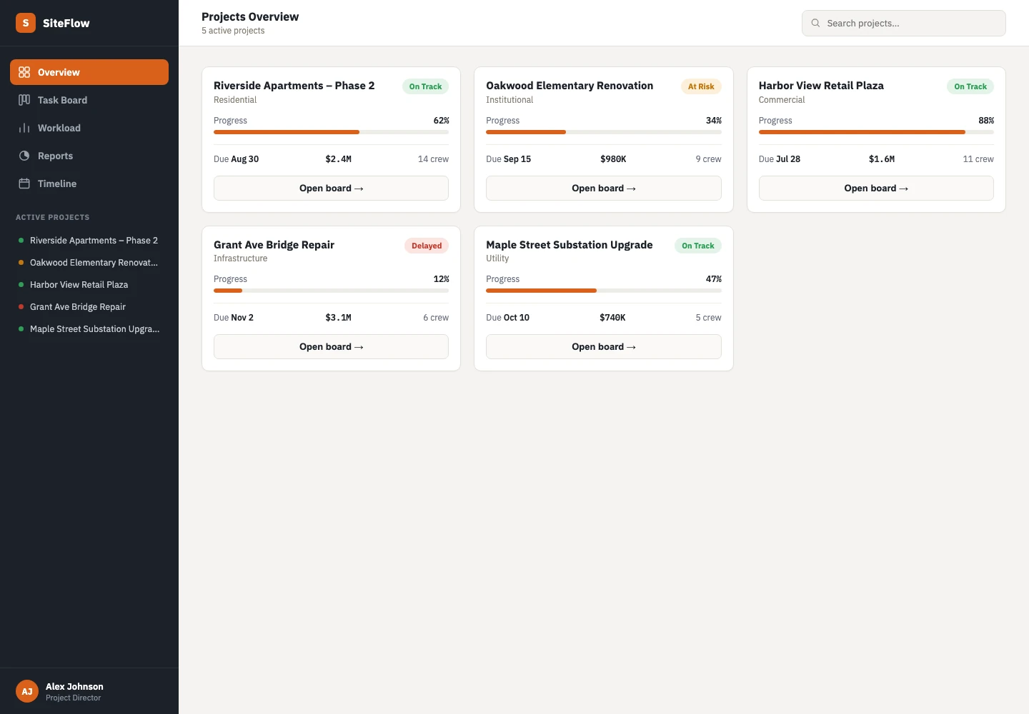
A business dashboard should show what needs attention, why it matters and who can act. Start with the decisions your team makes each day or week. Then choose the information needed for those decisions. Collecting every available metric usually makes the screen harder to use.
Build around a small set of decisions, trustworthy definitions and a clear route from information to action.
Choose a reader and a recurring decision
A founder reviewing the week and a coordinator managing today’s work need different views. Name the primary reader before selecting metrics. Describe the decision in a sentence, such as “Which project needs help before its next milestone?” or “Which enquiry needs a response today?”
Microsoft’s dashboard design guidance emphasises the audience and the information they need to make decisions. Apply that principle by keeping a daily operations view focused on immediate priorities and offering detail when a reader needs it. A management overview can summarise trends without reproducing every operational row.
Use a compact operational starting set
The right measures depend on the business, but four areas make a practical first discussion: incoming work, work in progress, blocked decisions and upcoming commitments. Each should lead to a clear action.
In an illustrative service business, the dashboard could show unassigned enquiries, projects with a milestone at risk, approvals waiting on a named owner and tasks due today. These are suggested starting points, not a universal KPI list. Remove any item that nobody uses to make a decision.
- Enquiries awaiting review → assign or respond.
- Projects with blocked tasks → investigate the blocker.
- Approvals waiting beyond an agreed window → ask the owner to review.
- Upcoming commitments → confirm capacity and readiness.
Define every number before designing its chart
“Active projects” sounds clear until one team includes paused work and another excludes it. Write down the definition, source, period and owner for each measure. If people interpret a number differently, a polished dashboard can make the disagreement less visible without resolving it.
For example, define an overdue approval as an open approval whose due time has passed in the agreed business timezone. Decide how paused requests and reassigned owners behave. Show the last successful data refresh so yesterday’s snapshot cannot be mistaken for live status. Missing information should appear as unavailable, not silently as zero.
Make exceptions easier to find than decoration
Use visual emphasis for the information that changes a decision. A list of blocked projects can be more useful than a large decorative chart of total activity. Reserve colour for meaningful states and explain those states in text.
When a trend matters, label the period and comparison clearly. When a single case matters, let the reader open the underlying record. A count of pending approvals should lead to the approvals, ideally with owner, due date and next action. A chart without a route to action risks becoming another report people glance at and ignore.
Design access around roles
Not every reader needs every record. Define what owners, managers and contributors may see and change. A team dashboard should not expose sensitive customer or employee details simply because those fields exist in the source system.
Separate viewing a measure from approving a change. Decide whether actions happen inside the dashboard or in the existing system of record. If two tools can edit the same information, establish how conflicts are handled. Document who investigates stale data and which screen the team should trust during an outage.
Validate with a weekly review, then simplify
Before building a large reporting layer, sketch a view and walk through real decisions with the intended users. Ask them what they would do next. Where they need to open another spreadsheet, determine whether the missing context belongs in the dashboard or is better reached through a link.
After launch, review which measures are used, which definitions cause questions and which alerts are ignored. Agree changes with the process owner. A dashboard is useful when it supports a repeatable decision; its value cannot be judged by the number of charts on the page.
- Can a reader identify the priority without an explanation?
- Does every measure have a definition and owner?
- Are unavailable or stale values obvious?
- Can the reader reach the record behind the number?
- Is access appropriate for each role?
Further reading
RELATED SERVICE
Business dashboards →TURN THE IDEA INTO A NEXT STEP
Let’s make it work
for your business.
Bring the reports your team currently pieces together. We can help turn them into a focused operational view.
Book a project call ↗